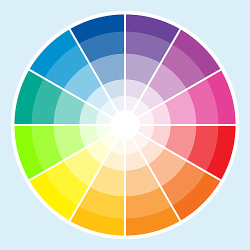
When designing graphics for your display advertising campaign, you'll consider several things. Is your ad copy effective? Your call-to-action prominently featured? However, there is one thing that you may not be thinking of that could potentially boost — or sabotage — an otherwise effective campaign: color.
It's been reported that color can influence people's moods, and even their perceptions of things like physical space and temperature. But did you know that color can also affect consumers' brand perceptions? Here are five do's and don'ts for using color in your display advertising campaign.
DO: Use Orange to Convey Value
Environmental psychologist Sally Augustin, PhD, said in a recent interview with Forbes that orange is a color that many people associate with a good value. Augustin says that orange "helps customers view [retailers] as a low-cost provider of valuable goods." However, this can be a bit of a double-edged sword, as it can make high-end products seem cheap. If you are trying to use your display advertising to emphasize a good price and value, orange is a great choice. However, if you are advertising luxury items, you may want to pick something else.


